


The skills of recording and presenting data collected during scientific enquiries is the fifth skill area covered in this series of primary science blogs.
What types of recording should we start developing from an early age?
Most young learners starting school are already starting to communicate about their interactions with the living things, objects and events they experience. Providing opportunities to talk about things they observe, and helping them expand the vocabulary needed to make sense of the world lays the foundations of all scientific understanding.
The drawing of simple diagrams (pictures at this stage) also needs to be taught. As the learners start writing they can begin to develop the skill of labelling diagrams, which can cause confusion.
Charts, that require learners to translate what they see in a form that other people can interpret, are another feature of early recording skills. Examples might include colour coding (eg red is hot, blue is cold) or ticks (yes) and crosses (no) placed next to pictures of objects being tested. As with labelled diagrams these charts initiate our learners into efficient ways of telling others what happened in their scientific enquiries.
How does the skill of recording results in tables progress through the primary years?
Soon the early recording charts will develop into simple tables; another skill that learners find difficult at first, not least because of the everyday use of the word ‘table’. Simple two column tables should be introduced first, with the first column filled in for the learners. The second column might require a tick or cross to indicate, for example, if the objects listed (or drawn) in the first column are magnetic or not.
Designing your own table increases the level of demand greatly, but actively teaching about how tables are constructed and how to interpret them will help learners make another important decision in their scientific enquiries ie ‘How will we record our results?’ (See Strategies that follow). Eventually, in Stages 5 and 6 the higher-attaining learners should be able to design more complex tables in which they can record their repeat observations or measurements.
What does progression in graphical skills look like?
A key feature of presenting data collected in scientific enquiries that generate numerical data is the ability to draw bar charts. This needs our learners to master scaling the vertical axis and to become familiar with the conventions of graph drawing.
These skills can be introduced with pictograms, starting with concrete representations of results that enable us to visualise our results more easily than the data in a table. Hence graphs are tools used to identify patterns in results.
The nature of the variable under investigation in a ‘fair test’ enquiry determines the use of a bar chart or the more demanding line graph.
Remember that:
- categoric variables (described by words) under investigation, and changed in each test, are displayed on bar charts whereas continuous variables (which will be measured) are shown on line graphs.
Therefore the choice of variable to investigate will impact on the level of demand in the skill of recording and presenting data. Bar charts are more readilt accessible to learners than line graphs. (See Strategies that follow).
What does progression look like in the skills of recording and presenting?
The ability to record and present data will develop at the same time as learners’ numaracy skills will develop throughout their primary education.
Learners will move from communicating their findings in simple ways such as, talking about their work, through drawings, and simple charts
- to describing their observations using more scientific vocabulary and recording them, using simple tables if appropriate.
- to recording their observations, comparisons and measurements using tables and bar charts.
- to beginning to plot points to form simple line graphs
- to recording observations and measurements systematically and, when appropriate, presenting their data as line graphs, including the use of computers if possible.
So how can we develop the skills of observing and measuring?
Here are some strategies that we can use to develop the skills of recording and presenting in scientific enquiries:
STRATEGY 1 – Practise drawing diagrams to record observations
Learners are used to the 2-D presentations of real objects and people, scaled up or down, to fit on the page of a book. They gain early experience of painting their own pictures to scale (although not very accurately at first!).
In science their drawing and observational skills are developed to notice relevant detail. Help can be given in labelling drawings (with label lines indicating specific detail referred to). These features transform a drawing or picture into a diagram.
Drawing small objects such as seeds and scaling them up are more difficult than scaling down. The use of magnifying glasses helps us to see the detail that a diagram could usefully show the viewer and help learners visualise the process of scaling up.
STRATEGY 2 – Physical representations of bar charts
To aid younger learners’ understanding of bar charts, look for chances to represent results physically on a grid and construct a bar chart that relates directly to their measurements (perhaps non-standard measures at this stage).
For example, if you were looking at ‘Which ball is the bounciest?’ you could cut pieces of string or wool to the height each ball bounced marked on a wall. The string can then be transferred to a piece of sugar-paper, stuck at either end with tape to produce a record of how high each ball bounced. A picture of each ball at the base of the length of string would complete the display of the results. The learners can then appreciate the ‘picture’ of their results in a ‘concrete’ representation without worrying about the problems associated with scaling a vertical axis on a formal bar chart.
Learners who have experience of physically making this type of chart will more readily understand the more abstract bar charts later on.
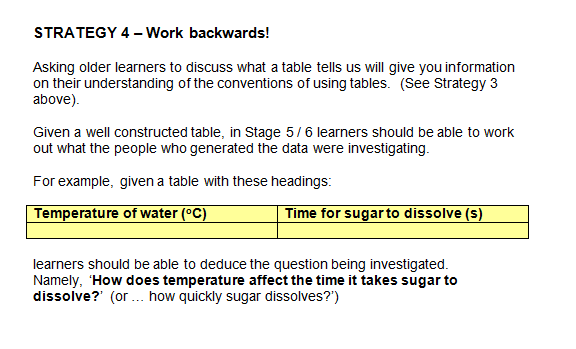
STRATEGY 3 – Explicitly teach learners the purpose and layout of tables
Learners need to be taught how to read from tables and how to fill in tables.
Starting from simple charts that merely require the learner’s input to be linked in some way to the picture you provide, to introducing lines forming boxes to link things horizontally on a page, to using one heading in a table, followed by two headings in a two-column table. Pictorial representations can be used before reading and writing skills allow text to be used.
Giving learners lots of practice filling in tables also helps when they are expected to generate their own data and present it in tables. For example, provide the class with data and ask them to sort it into a table for a homework exercise before tackling a related enquiry. You can differentiate the task by giving the table with headings to some learners, the framework of the table without headings filled in, or just providing the data set to your higher-attaining learners so that they can plan the table and fill it in themselves.
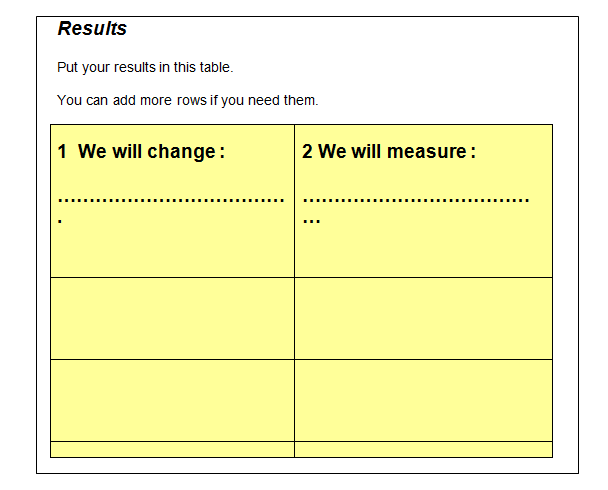
Once all learners understand some basic rules about how tables are constructed, they can all try designing their own tables. Even in illustrative practical work, in which learners are following a set of instructions, they can still be challenged to design a table to show the results. If the table is provided for learners, a couple of minutes explaining why the particular headings were chosen, where units are shown if needed, and the arrangement of the table will help in subsequent enquiriess (where learners will decide for themselves on the layout of their results table). A suitable learning objective relating to tables can be part of the lesson plan and shared with learners before the enquiry.
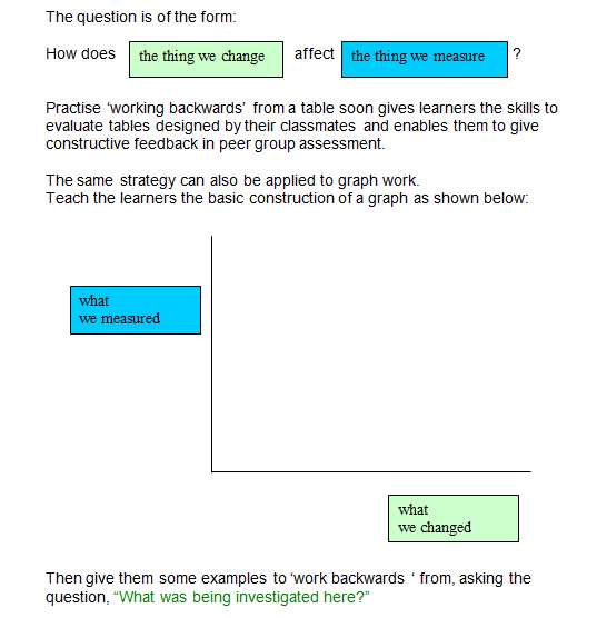
The independent variable (‘the thing we choose to change’) will appear in the first column of your table. The dependent variable (‘the thing we are judging / observing / measuring’) will go in the second column.
Look at the Help Sheet below:
STRATEGY 5 – Show the ‘big picture’
Having three posters showing the positions of the independent variable (the thing we change) and the dependent variable (the thing we measure or judge) in the different stages of an investigation will help to clarify the construction of tables and graphs. (The arrows show movement of the coloured post-its).
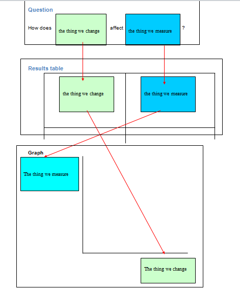
You can model the movement of the variables to the whole class using two differently coloured post-its and the posters above. In this way tables and graphs start to make sense. Then the learners can understand that tables and graphs have a consistent structure that enables the reader to interpret them.
STRATEGY 6 – Show what a good graph looks like
We need to be sure that all our older learners are aware of what constitutes a good graph. A set of rules can be devised with a Stage 5 or 6 class, which is a far more effective technique than just providing a prescribed set of rules.
The discussion about graphs can be stimulated by providing examples of poor graphical work. You can use graphs with:
- uneven scales,
- scales that result in graphs that are too small,
- large thick dots used to plot points,
- large areas of the graph unused when scales always start at 0,0
- axes left unlabelled
- axes labelled but with units missing
Different groups can discuss different examples. Then from the criticisms arrive at a positive set of statements that all good graphs will have in a plenary!
Lots of practice in constructing graphs will help. Learners will progress from simple examples, carefully chosen so that the data presented in a table can transfer neatly on to the graph paper without requiring scaling skills, to more complex sets of data.
Strips of graph paper (which will be 2 x 2 x 0.2 cm graph paper in Stages 5 and 6 if learners’s numeracy skills are adequate) can be provided for learners to try out different scales. The strip can be overlaid on the sheet of graph paper to be used and checked if necessary before proceeding. This saves the frustration of starting over again if an error is made.
REFLECTION SECTION
- Think of some learners in your class who really struggle to fill results into a table you have provided for them. What difficulties do they experience? How do you tackle their problems?
- Imagine your class were doing an investigation into toy cars on ramps. How could you differentiate at three different levels for learners recording their results in tables?
- Think of an investigation that could be used as an opportunity to make a physical display of the results that correspond to a bar chart. What would the display look like?
- List all the skills a learner needs in order to draw a bar chart independently.
- Do you ever spend time teaching your class how to construct a table? If so, how often and is the skill ever included in your learning objectives?
- How are the headings in a table linked to the original question posed in an investigation?
- 7. Would you be confident using post-its and a poster to model the movement of the variables through the different stages of an investigation?
- What would you include in a set of rules for drawing good graphs?
- Which will be more accessible to learners at Stage 4, line graphs or bar charts? (See Progression in Skills of Recording / Presenting results). How will the question to be investigated determine the type of graph that will be produced?
- What are the most common mistakes you find when learners draw graphs in your class?
The work of the AKSIS project has produced a series of excellent publications to provide resources for much of this work. (See ‘Developing understanding’ which contains ICT support, and ‘Getting to grips with graphs’ available from ASE publications)